How does the music industry make money?
Exploring revenue streams through interactive data visualizations
Over the past couple years, I’ve reconnected with a love for live music. My boyfriend and I try to attend as many concerts as possible for the bands we enjoy—as long as childcare is possible, and the venue isn’t completely awful (I’m looking at you, Xfinity Center in Mansfield, MA). Last weekend, after attending another fantastic show at the MGM Music Hall in Boston, I started thinking about data and the music industry. Specifically, how is the music industry making money these days, in the era of Spotify and Apple Music?
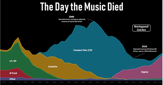
While I initially wanted this post to focus on the live music industry, it is surprisingly difficult to find data (and data visualizations) on live music revenue through the years. If anyone finds anything, please let me know and I’ll make sure to dive into it in a later issue. In my research, I stumbled upon the Data + Music Viz Gallery on Tableau Public. Really beautiful and interesting information here, including one on recording industry revenue over time (see chart below, and interactive dashboard at this link).
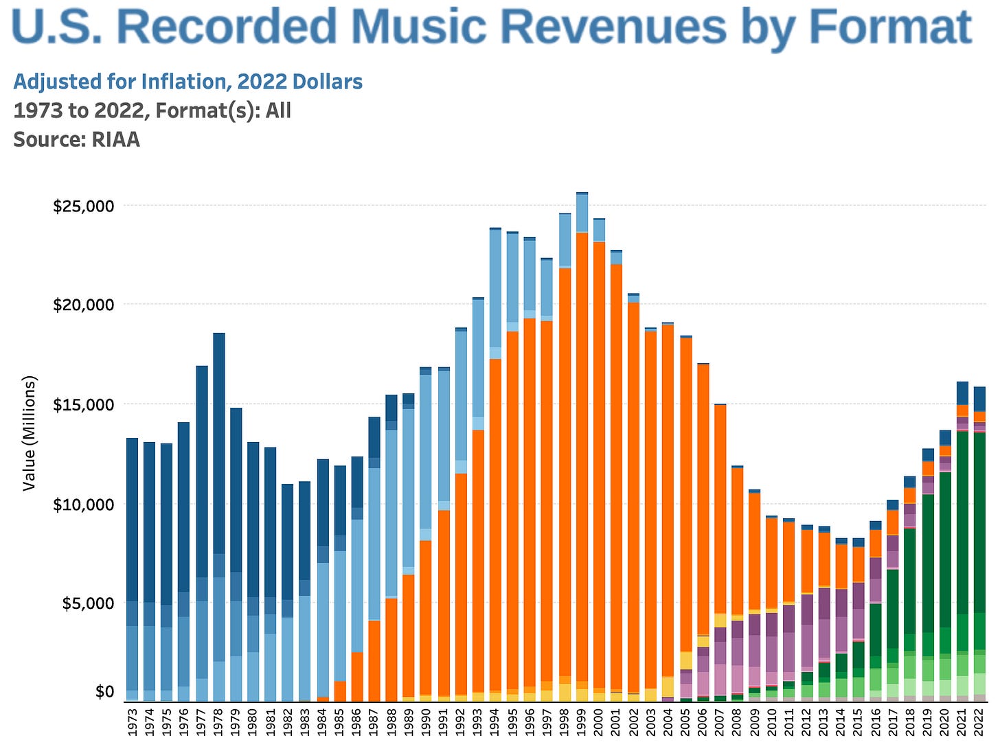
Recording industry revenue is a long way away from the glory days of 1999, when it hit peak CD sales and grossed $22 billion (a figure adjusted for inflation). The chart above is called an area chart, which are what happens when a bar chart and a line chart merge together (my own interpretation). Area charts are good for looking at total amounts over time, and looking at distributions of totals across categories. However, if you’d like to view a distribution by each year, you’d want to use a bar chart, like the one below by the Recording Industry Association of America.
Each color in this chart represents a different revenue format—orange is CD, green is paid subscriptions, etc. I would say both charts are useful and generally easy to read, but have different purposes and likely were made with different audiences in mind. The “Day the Music Died” chart has a clear purpose—to make a statement that music revenue has decreased dramatically. The analyst who created it combined formats into larger categories, and used an area chart to make a broader point about the industry. The second is more detail-oriented. If you click on the link to the interactive dashboard, you will see a legend that shows how each color and shade represent very specific formats. The data is similar to the first, but showed in what you may consider a more “scientific” manner.
Both these charts show how the recorded music industry revenues have declined over the years. And all signs seem to point towards the live music industry to make up (or more than make up) the difference. Live music is more than just ticket sales—it’s merchandise sales, sponsorships from brands that include wearing or using their products on stage, meet and greets with fans, and if you’re like Taylor Swift or Beyonce, royalties and ticket sales from live recordings played in movie theaters or streaming.
My favorite concerts of the past year
I had to include a quick viz of my own, listing the concerts I’ve attended over the past year or so, and how much I enjoyed them, from 1-100.
If you’re reading this, you’re one of my earliest subscribers! I’m so happy you’re here and hope you’re enjoying the ride so far.
Data viz links
Another take on US recorded music industry revenue data, using a form of area chart. Maybe a little too stylized? Data visualizations should capture the audience’s attention, but for the right reasons. Making something pretty generally should not take precedent over the overall message (at least in a business context).
Storytelling with data: the best blog about all things data visualization. I’ve learned a lot from this author.
A Dash of Data: a fun blog with data visualizations on Taylor Swift and motherhood that I found recently.


As a lifelong music fan, I love this topic. However, I'm a little disappointed that Kevin Flerlage puts all of his emphasis on Napster (the hot music topic of 1999). He barely mentions paid streaming services (the topic over which most current "death of the industry" analyses focus on today) and the current rise in recorded music revenues over the last decade. Don't get me wrong, the Spotify model has its flaws, but focusing on the death of the CD and the rise of downloads seems a little narrow. There was a point in time (1978) when the rise of the cassette and the ability to record music off the radio and dub copies of cassettes was thought to be the death of the industry, but then CD's came around with higher quality audio and music sales soared. It will be interesting to see how high streaming revenues eventually peak, when they peak, and what the next recorded music disruptor will be.
(For the record, my first vinyl was Michael Jackson reading an abridged version of the E.T. story, my first dubbed cassette was Michael Jackson's Thriller, my purchased cassette was Def Leppard's Hysteria, first CD was Pearl Jam's Vs., first song I remember downloading an mp3 was Radiohead's Faithless the Wonder Boy (because listening to it as a cassette single b-side was very inconvenient), first purchased mp3 was Pearl Jam's Corduroy from The Bridge School Collection, Vol 1, and not sure what my first streamed song was, but my most streamed artist of 2023 (so far) is Taylor Swift.)